Analysis & visualization
- Jean-Christophe Barbiche (Unlicensed)
- Ramy Zaki
Consolidate & visualize monitoring results to identify & analyse the response gaps
The IMO consolidates monitoring results, and perform analyses as planned in the initial analysis plan set up for the response. The use of visualization tools such as maps and infographics during the analysis facilitate the identification and reporting of response gaps
Review the WASH response's monitoring and analysis plan
The WASH Response Monitoring plan must include an initial analysis plan. The analysis plan clarifies the type, frequency and outputs of the analysis that should be made from the monitoring data. It also clarifies the role and responsibilities in the analysis process. It includes a mapping of the data to be collected, and ensures each collected data has a clear purpose. Many analysis can be done directly from the W-matrix. A 2016 GWC 4W framework developed by the GWC presenting the type of analysis that can be done using a W-matrix can be found in the document section on top of this page. Examples of Analysis Plan can be found in the various Field Examples in the Monitoring Plan section of the Strategic planning chapter.
Consolidate monitoring results
WASH coordination platform must gather and collate monitoring data from various sources to perform analyses at national level, and subnational level when relevant. Sub-national IMO and sector coordinator will play an important role in ensuring validation and cleaning of data, before reporting it to the national level.
The complexity of gathering and consolidating monitoring data depends on the monitoring mechanism set up:
Gap analysis: Who is doing it?
While data compilation, cleaning and analysis is often the responsibility of IMO, the WASH sector coordinator must be involved in the process to ensure that gap analysis answers to strategic priorities and reporting is oriented towards gap resolution and advocacy, and not just on information sharing
- When monitoring tools are centralized over the response (W-matrix, Financial Tracking Services), data gathering and analysis can be simple, provided that the reporting system has been well designed and partners are trained and supported to report timely their project data. See also Activity reporting section in the Response monitoring chapter
- When monitoring tools used by partners are non-standardized or non-harmonized tools (ex: partner's internal quality monitoring reports), data consolidation and analyse will be more challenging. It is advised for WASH coordination platform to provide guidance in the SOF on minimum criteria for harmonization of monitoring mechanism between partners. For instance, all reports of Feedback and Complaints Mechanisms used by partners should provide results on the achievement of the 2012 GWC WASH Minimum commitments for the safety and dignity of affected population.
Analyse monitoring results using maps and infographics to identify gaps
Once monitoring results have been consolidated, often in the form of large database, they should be visualized in such a way that they can help identifying response gaps. This can be done using Desktop Mapping tools and infographics (see text boxes below). Analyses can also involve the triangulation of activity-tracking data (5W-tool) with other datasets. Outputs of the analysis can be for example to highlight the following response gaps:
- Imbalances in sub-sector implementation (ex: a focus on water and hygiene at the expense of sanitation)
- Imbalances among locations of intervention (ex: a focus on easy to reach at the expense of hard to
- Agencies with interventions consistently below minimum standards, or not in line with the HRP or WASH SOF response framework
- Gaps in number of people reached as compared to people targeted, or People in Need figures
- Etc.
In the document section on top of this page can be found various gap analysis guidance and template, as well as many examples of gap analysis report done by WASH Cluster platforms in various recent emergencies.
What is desktop mapping?
Desktop mapping consists in using computer to perform digital mapping functions, often using GIS (Geographical Information System) softwares. Desktop mapping tools are provided in the documents folders in the Visual and reporting templates section of the Information management chapter.
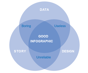
What are infographics?
Infographics are visual representation of data, for example as charts or diagrams. Infographics should allow reader to easily compare needs or response coverage between geographical areas, identify trends, patterns, exceptions etc. Efficient infographics are a mix between good quality data, interesting “story” and relevant design, as explained in the below diagram:
 | Other recommendations to design high quality infographics:
Some tips regarding basic visualization and infographics, as well good & bad infographics examples, can be found in the 2015 JIMT Visualization tips.pptx, and in the Other tools folder on top of this page |
Key external web links