| Expand | ||
|---|---|---|
| ||
| Expand | ||
|---|---|---|
| ||
| Expand | ||
|---|---|---|
| ||
Consolidate and visualize monitoring results to analyse the response gaps
Set up the analysis plan in the response monitoring system
It is important not to wait to receive the results of monitoring to start the analysis, but to develop an analysis plan in parallel with the Response Monitoring plan, listing the type of analysis that should be done and how and when they should be performed. Example of the type of analysis that can be done by the WASH Coordination platform can be found in the Key Guidance and tools, as well as examples of Analysis Plan.
Consolidate monitoring results
| Align | ||
|---|---|---|
| ||
WASH coordination platform must gather and collate monitoring data from various sources to provide an analysis at response level. Sub-national IMO and sector coordinator will play an important role in ensuring good quality and cleaning of data, before reporting it to the national level. |
The complexity of the analyse will depend on the monitoring source:
| Info | ||
|---|---|---|
| ||
While data compilation, cleaning and analysis is often the responsibility of national IMO, the WASH sector coordinator must follow up the process to ensure that gap analysis answers to strategic priorities and reporting is oriented towards gap resolution and advocacy, and not just on information sharing |
- When monitoring tools are harmonized (which is the case for 5W matrix) or centralized (Financial Tracking Services) analyse is easy.
- When monitoring is done by partners using non-harmonized tools (internal quality check list or Feedback and complaint mechanism), its consolidation and analyses will be much more challenging
Analyse monitoring results using maps and infographics
Once results of monitoring and evaluation have been consolidated, mostly in the form of large database, they should be presented in such a way that they can help identifying response gaps, using Desktop Mapping tools and infographics. Such analyses also involve the triangulation of activity-tracking data (5W-tool) with other datasets. Infographics should allow comparison of needs or response coverage between geographical areas, identify trends, patterns, exceptions.
It can be important to highlight the following:
- Imbalances in sub-sector implementation e.g. a focus on water and hygiene at the expense of sanitation
- Imbalances in type of activity implemented e.g. a focus on temporary measures rather than semi-durable systems
- Imbalances among locations of intervention e.g. a focus on easy to reach at the expense of hard to reach
- Donors / Agencies with interventions consistently below minimum standards i.e. not in line with the HRP/SOF response framework
- Gaps in number of people reached as compared to people targeted, or initial People in Need figures
| Info | ||
|---|---|---|
| ||
Desktop mapping consist in using a desktop computer to perform digital mapping functions. ArcGIS and QGIS are common GIS (Geographical Information System) software used for mapping. A more detailed setup-by-step workflow is provided in QGIS, which leads you through basic map production.Having access to map templates can speed up the process of making maps on the fly/during an emergency. For IMOs without GIS experience, it is easy to make maps in MS PowerPoint or MS Word by converting GIS shapefiles to enhanced graphic files. An IMO with GIS software can easily convert the administration boundaries for use in PowerPoint and share them. Some desktop mapping tools are provided in the documents folders on top of this page. You can access to the GIS administration boundaries off the CODS/FODS website https://www.humanitarianresponse.info/applications/data or through the OCHA/MapAction https://mapaction.org/resources/ |
| Info | ||
|---|---|---|
| ||
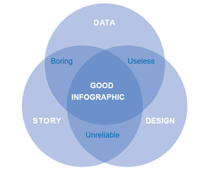
Infographics are visual representation of data, for example as charts or diagrams. Efficient infographics are a mix between good quality data, interesting “story” and relevant design, as explained in the below diagram:
|